The cashflow statement, explained
By Benoit Sarrade
/ June 16, 2022
Cash is king. You probably heard that one before, and for companies, it does hold some truth. Cash is the...
Read More

Click here if you are looking for Part 2 of this story.
With over 30 years of experience, MEGA Learning has had the opportunity to work with thousands of students and managers across the world, from different schools and industries and speaking several languages.
Yet, when our team first heard of accessibility and we started the discussion about users with special needs, we just could not think of any participant who had voiced concerns or struggles using our simulations.
Does that mean that our products were already accessible? Negative. Does that mean that no participant needed an accessible interface to our games? Most probably negative. What that means is that people with a need for accessible features are still often invisible, or do not feel that there is space for them to phrase their needs. Next to a feeling of discrimination, this can lead such users to drop out of the game and miss out on a unique learning experience.
For us, that was a reality check: we have to constantly keep thinking from the users’ perspective, and not just one type of user but all types of users who are likely to play our games.
The question around accessibility emanated from our partnership with Harvard Business Publishing, which we signed in 2020: among the technical adaptations and additional self-study material that we were requested to produce to comply with the HBP catalog, our games also had to be WCAG compliant.
Let us rewind and come back to the very definition of accessibility, “the quality of being easily understood or appreciated” according to the Oxford Dictionary. Accessibility, in the case of product design, for example, incorporates how people with disabilities approach, enter and use the product.
The WCAG 2.1 standard, which stands for Web Content Accessibility Guidelines, aims to provide a framework within which product developers can assess how accessible their product is: for example, whether the web page can be read with a screen reader, whether contrasts are high enough, whether visual information is always accessible by users with visual impairments, etc.
The WCAG standard was developed by the World Wide Web Consortium (W3C), self-described as an international community developing open standards to ensure the long-term growth of the Web. The first version of the WCAG was published in 1999 and the WCAG 2.0 were published end of 2008. In the latest version, recommendations for developers are listed according to four main principles, stating that the target document should be perceivable, operable, understandable, and robust. Each of these principles includes a few guidelines that provide more clarity about what the principle stands for. Principles and guidelines of the WCAG 2.0 remain stable over time, but the technique used by developers to meet those guidelines constantly evolve with technology and their level of expertise.
Examples of guidelines are “do not design content in a way that is known to cause seizures” (guideline 2.3), “make web page appear and operate in predictable ways” (guideline 3.2) or “create content that can be presented in different ways without losing information or structure” (guideline 1.3).
The team at Harvard Business Publishing has been supportive since the start of this project, and thanks to their accessibility experts, we were able to set up a list of adjustments to be made for our business simulation interface to be WCAG 2.1 compliant.
One thing that we learnt at MEGA Learning, is that the standard seeks to not discriminate users based on which impairment they have: for example, color contrast is a criterion we worked on, as some users might have a visual impairment but still be able to see, and some others might have no visual impairment but a cognitive impairment, etc. The color contrast criterion is not important to non-sighted users, but some other criteria overlap for both sighted- and non-sighted users or can be of interest for non-sighted users only.
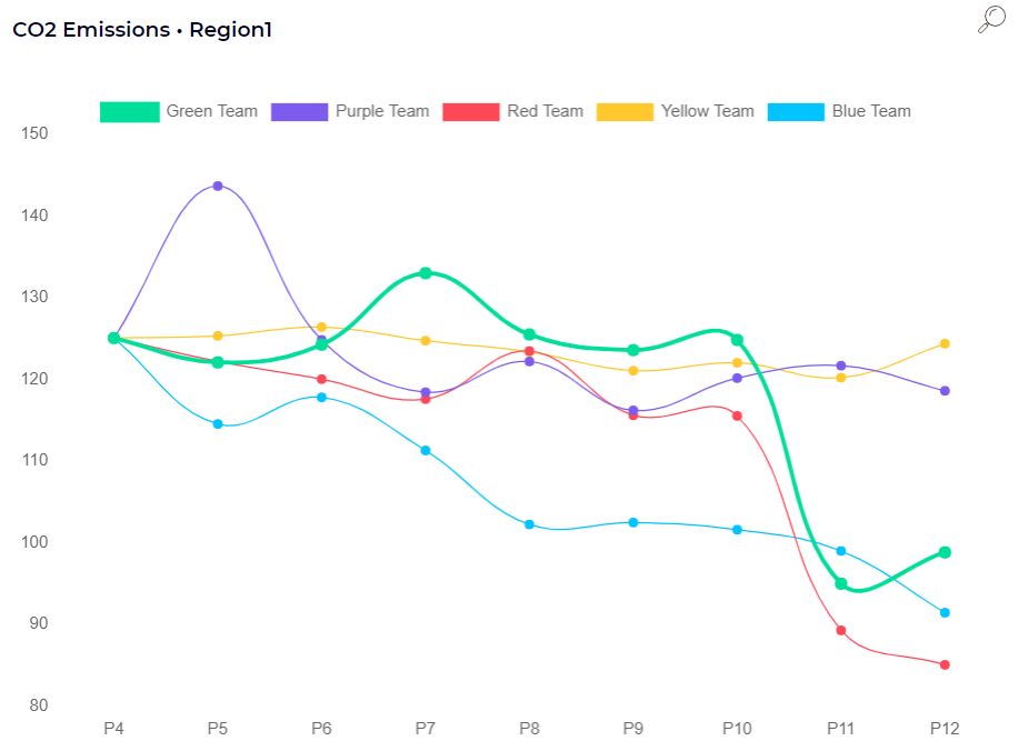
A few elements of our interface did not pass the contrast check, especially on interfaces used by Blue or Yellow teams in our games. In the example below, the contrast between white and blue is not fine enough for users with a visual or cognitive impairment.
For those of you who have not seen our interface yet – it is never too late, ask for a demo here 😉 – we tap into the power of visualization to help students understand some key concepts. For example, for each of the business lines that teams manage, we think that understanding the cost drivers is easier when represented with a bar chart, with each driver being a percentage of the total cost. This helps game participants understand how they can reduce their costs, and the underlying tradeoff such reductions entail.
In our business simulation, participants can always untick one of the captions elements, to only show what matters the most for them: the Red team could untick all other teams just to see their own results, for example. This feature was already in place before we started to think in terms of accessibility and allows students to isolate a specific information on a graph.
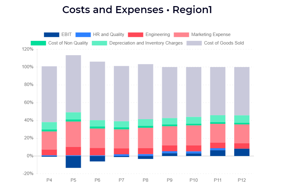
As another example, if we look at the costs and expenses graph that we referred to earlier, participants can also untick all elements to just show the cost driver that matters for them. Yet, the issue is that if users with impairment had to untick elements across all graphs to understand them, it would be time-consuming, discriminating and could increase the risk of disengagement.
A ‘simple’ question such as color contrast does have consequences: our new interface has been developed with those colors in mind, colors which are part of our brand’s DNA and convey the image of a playful yet result-oriented organization with a mission to teach business to university students and corporate employees, using business games.
The solution popped up during a brainstorming session: we should keep the interface as is, i.e., with the current color contrasts, to not corrupt our graphic charter, but integrate a feature, like a switch button, that allows users to easily jump to a high-contrast mode – similar to when you turn on a dark mode on an app or a page. This mode can be activated and deactivated at any point during the game and is linked to the user, not to the team: for example, if one user on a team of five decides to turn on the high-contrast mode, they can do it on their own computer, without impacting what other team members see on their computers.
With the help of our graphic designer, we launched a high-contrast color scheme that draws inspiration from the original colors of the interface – a member of the Blue team looking at their interface using the high-contrast mode will still see a shade of Blue, for consistency reasons.
This solution allows all sighted players to access the visual information with the level of accessibility that is the most comfortable for them.
Stay in touch for the second part of this story: we will explore how we made our interface screen-reader-friendly, and how we tweaked the decision section to ensure an optimal experience for non-sighted users and, generally, screen reader users.